The theme is the visual design of your site. Themes customize content (e.g. pages, posts, text, images) and display it in the theme design.
The theme determines the location of your menu, logo and widgets on your site. Themes also define color schemes, default fonts, and other design features.
A WordPress theme is a collection of files that make up the layout of your website. Themes have HTML, PHP, and CSS, and sometimes use JavaScript/jQuery as well.
Child theme is a sub-theme to control the appearance and function of the website theme like the parent theme. The difference is, this child theme has a different directory from the parent, so any changes to the child theme will not disturb or damage the parent theme.
The history of lightweight website themes
The concept of website themes has evolved over time alongside the development of the web and website creation tools. Let’s take a brief look at the history of website themes.
Early Websites (1990s), In the early days of the World Wide Web, websites were mostly basic and text-heavy, with minimal design elements. There were no standardized website themes during this period. Websites were typically built from scratch using HTML, and each website had a unique design.
Rise of CSS (late 1990s – early 2000s), With the introduction of Cascading Style Sheets (CSS), web designers gained more control over the visual presentation of websites. CSS allowed for consistent styling across multiple web pages, making it easier to create a unified look and feel. However, website themes were not yet widely available or standardized.
Emergence of Content Management Systems (CMS) and Themes (early 2000s), Content Management Systems such as WordPress, Joomla, and Drupal gained popularity, offering a more user-friendly approach to website creation and management.
As these platforms grew, developers started creating and sharing website themes specifically tailored for these CMSs. Users could choose from a variety of pre-designed themes and easily apply them to their websites.
Theme Marketplaces and Customization (mid-2000s), Theme marketplaces started to emerge, providing a centralized platform for developers to sell their themes and users to browse and purchase them.
These marketplaces offered a wide range of themes with different designs, styles, and functionalities. Additionally, users could customize the themes further by modifying colors, layouts, and adding custom content.
Responsive Design and Mobile-Friendly Themes (2010s), With the rise of smartphones and mobile devices, the demand for mobile-friendly websites increased.
Responsive design became a crucial aspect of website themes, allowing websites to adapt and provide an optimal user experience across various screen sizes. Responsive themes became the norm, ensuring websites were accessible and visually appealing on mobile devices as well.
Modern Era (2010s – present), Today, website themes have become highly sophisticated and customizable. They often come bundled with a range of features and options to cater to different industries and purposes.
The marketplace for website themes has expanded significantly, with numerous theme providers and developers offering a vast selection of themes for various CMSs and website builders.
Themes continue to evolve, keeping up with the latest design trends, web technologies, and user demands. The emphasis on user experience, performance optimization, and ease of customization has become increasingly important in modern website themes.
Website theme structure
A website theme, also known as a website template or website design, refers to the overall visual and functional layout of a website.
It encompasses the design elements, styles, and features that determine the website’s appearance and user experience. A website theme typically includes the following components:
Layout and Structure
The theme defines the overall structure of the website, such as the arrangement of headers, navigation menus, sidebars, and footers. It establishes the framework for organizing content and provides a consistent structure throughout the site.
Visual Design
The theme includes the visual elements that determine the website’s aesthetics, such as color schemes, typography (fonts), graphics, and images. These elements contribute to the website’s branding and create a visually appealing and cohesive look.
Styles and Effects
The theme defines the styles and effects applied to various website elements, such as buttons, links, headings, and backgrounds. It determines the visual presentation of these elements, including their size, shape, color, hover effects, and animations.
Responsive Design
A modern website theme is designed to be responsive, meaning it adapts and adjusts its layout and content to different screen sizes and devices. This ensures that the website is accessible and user-friendly on desktop computers, laptops, tablets, and mobile phones.
Functionality
Some website themes come with built-in functionality or additional features. For example, a theme designed for an e-commerce website might include product listings, shopping cart functionality, and payment integration. Themes can also support additional features like contact forms, image galleries, blog layouts, or social media integration.
Website themes are typically created by web designers or developers and can be customized to suit the specific needs and preferences of a website owner.
They are often available for various website platforms or content management systems (CMS) like WordPress, Joomla, Drupal, or Shopify. Users can choose a theme that matches their desired style and functionality, and then modify it further by adding their own content, images, and customizations.
Lightweight And Responsive Website Theme
The lightest website themes are typically minimalistic in design, with a focus on simplicity, clean code, and fast performance. These themes prioritize speed, efficiency, and a streamlined user experience by minimizing unnecessary features and code bloat. Here are a few examples of lightweight website themes:
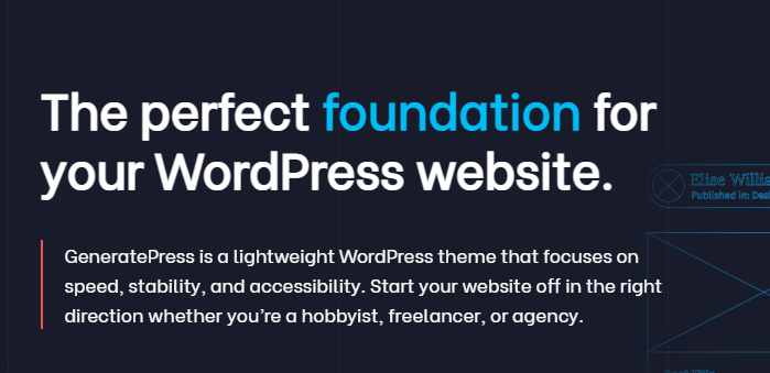
GeneratePress Theme
GeneratePress is a popular lightweight theme for WordPress. It is known for its lightweight code, fast loading times, and flexibility. It offers a modular approach, allowing users to enable or disable specific features as needed, reducing the overall website size.
Astra Theme
Astra is another lightweight WordPress theme that prioritizes speed and performance. It comes with a minimal design and offers extensive customization options. Astra is built with SEO optimization and fast loading times in mind.
HTML5 Boilerplate
HTML5 Boilerplate is a lightweight and responsive HTML/CSS template. It provides a solid foundation for building fast and optimized websites from scratch. It includes essential features and optimizations to ensure good performance.
Skeleton
Skeleton is a minimalistic and lightweight responsive CSS framework. It provides a grid system and a basic set of styles, making it easy to build lightweight and mobile-friendly websites. Skeleton is known for its simplicity and small footprint.
Milligram
Milligram is a lightweight CSS framework that focuses on minimalism and simplicity. It provides a clean and lightweight set of styles, allowing developers to build fast and efficient websites without unnecessary bulk.
It’s important to note that the actual performance and “lightness” of a website depend not only on the theme but also on factors like server configuration, optimization techniques, content optimization, and other customization choices.
While these themes are known for their lightweight nature, proper optimization and best practices should still be followed to ensure the best performance for your specific website.
light theme influence
Light themes, characterized by their bright color schemes, clean layouts, and minimalistic design, have gained significant influence in various aspects of digital experiences. Here are a few ways in which light themes have made an impact:
- User Experience (UX): Light themes are often associated with a sense of simplicity, clarity, and spaciousness. They provide a clean and uncluttered visual environment, making it easier for users to navigate and interact with websites and applications. Light backgrounds with dark text also offer high legibility, reducing eye strain and enhancing readability.
- Minimalism and Simplicity: Light themes align with the principles of minimalism and simplicity, emphasizing essential content and reducing visual distractions. By employing clean lines, ample white space, and a limited color palette, light themes create a focused and elegant user interface.
- Mobile and Responsive Design: Light themes are particularly suitable for mobile and responsive design, as they allow for a seamless transition between different screen sizes. Light backgrounds make it easier to read content on smaller screens, and they contribute to faster loading times, which is crucial for mobile browsing.
- Branding and Modernity: Light themes have become associated with modern and contemporary design trends. Many brands, especially in technology, software, and creative industries, have adopted light-themed websites and applications to convey a sense of professionalism, innovation, and modernity. Light themes can help create a positive brand image and make a lasting impression on users.
- Accessibility: Light themes often have higher accessibility compared to dark themes, particularly for individuals with visual impairments or certain types of color blindness. The high contrast between light backgrounds and dark text can improve readability and legibility for a broader range of users.
- Cross-platform Consistency: Light themes are widely used across various platforms, including websites, mobile apps, and desktop applications. This consistency in visual style creates a unified experience for users across different devices and platforms.
While light themes have gained popularity, it’s important to note that the choice of theme should consider the specific context, content, and target audience of a project. Ultimately, the goal is to create a visually appealing and user-friendly experience that aligns with the brand and fulfills the needs of the users.